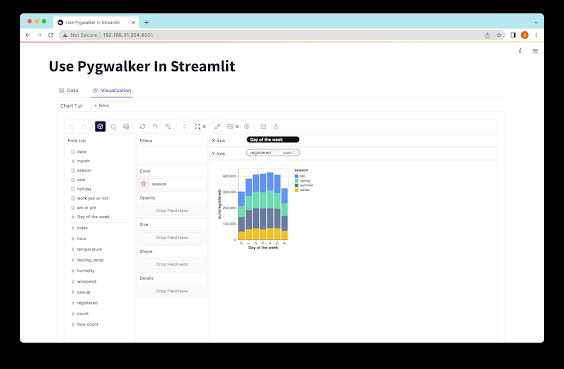
Data Visualization: 7 Good Examples
In a world that is increasingly data-driven, data visualization has emerged as a powerful tool that can help organizations communicate insights from data more efficiently. Whether you are looking to identify trends, uncover patterns or gain a deeper understanding of your data, data visualization can help you achieve your goals by making complex data more accessible and easy to understand.
In this article, we explore 7 examples of creative and impactful data visualizations that demonstrate the potential of data visualization to transform business insights.
1. Information Visualization
Information visualization is a type of data visualization that is focused on the effective communication of complex data sets. It is often used in areas such as journalism, scientific research and education, where large amounts of data need to be presented in an accessible and understandable way.
2. Charts
Charts are one of the most common types of data visualization, and they are used to represent numerical data in a graphical format. Common chart types include line charts, bar charts, and pie charts.
3. Graphs
Graphs are similar to charts, but they are used to represent more complex data sets, such as networks, hierarchies, and clusters. Common graph types include scatter plots, bubble charts, and network graphs.
4. Maps
Maps are a popular data visualization tool that are used to represent geographic data. They can be used to show population density, spatial distribution, and other location-based data. In recent years, interactive web maps have become increasingly popular, allowing users to interact with geographic data in real-time.
5. Dashboards
Dashboards are a type of data visualization that are designed for use in real-time decision-making. They typically consist of multiple visualizations, such as charts, graphs, and maps, and they are used to display key performance indicators (KPIs) and other metrics.
6. Analytics
Analytics dashboards are used to track the performance of digital marketing campaigns and other online activities. They typically include metrics such as page views, bounce rates, and conversion rates, and they are used to identify areas where improvements can be made.
7. Business Intelligence
Business intelligence (BI) dashboards are a type of data visualization that are used to monitor business performance. They typically include metrics such as revenue, cost of goods sold, and profit margins, and they are used to identify trends and areas for improvement.
Conclusion
Data visualization is a powerful tool that can help organizations communicate insights from data more efficiently. From information visualization to business intelligence dashboards, there are countless ways to use data visualization to gain a deeper understanding of your data and transform business insights. Whether you are looking to identify trends, uncover patterns, or gain a competitive edge, data visualization can help you achieve your goals by making complex data more accessible and easy to understand.
By incorporating data visualization into your data analysis toolkit, you can unlock the power of your data to improve your business performance and achieve your strategic objectives. Whether you are a data analyst, marketer, or business leader, the benefits of data visualization are clear. So why not give it a try today and see how it can transform your business insights?

Comments
Post a Comment